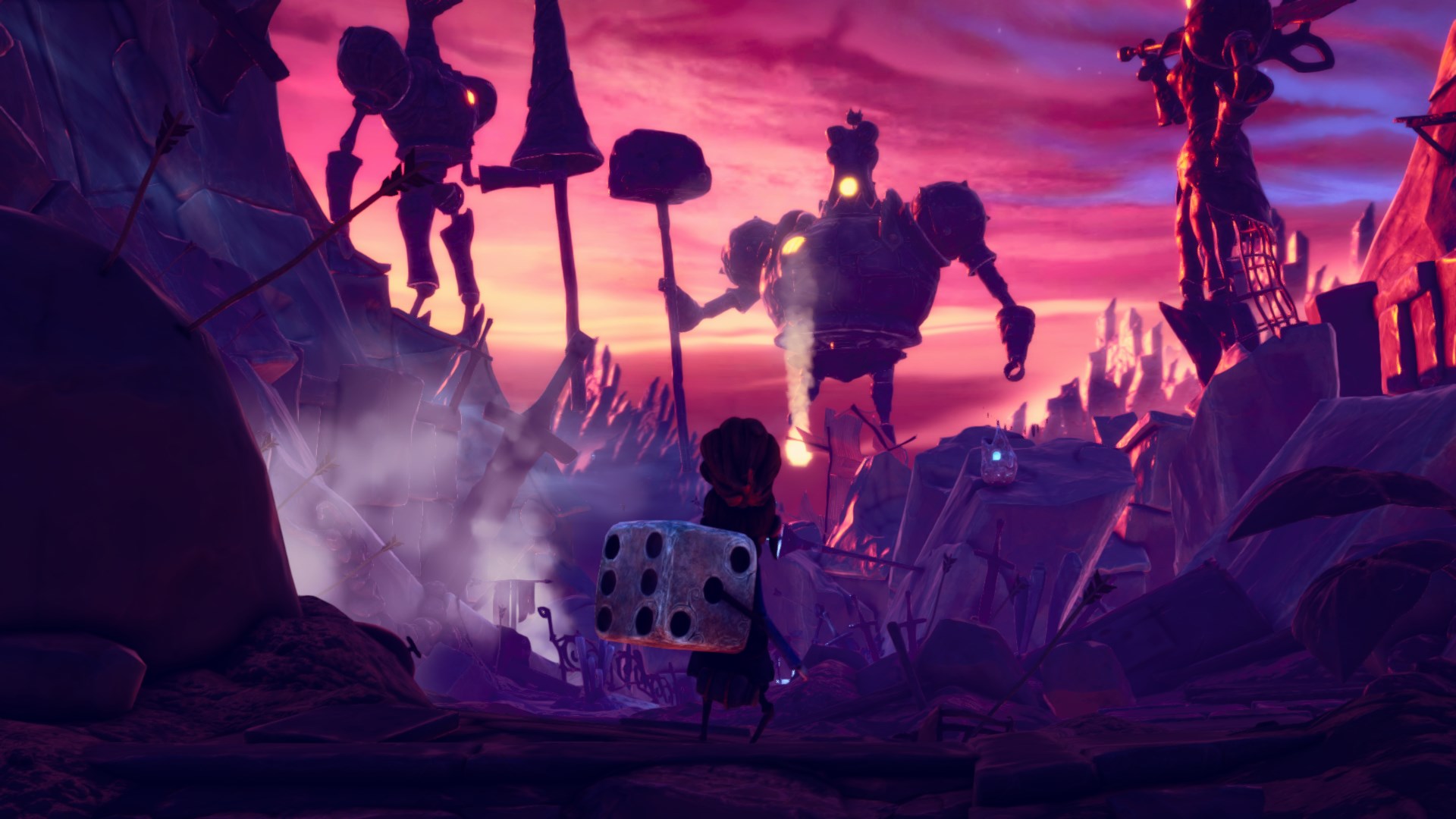
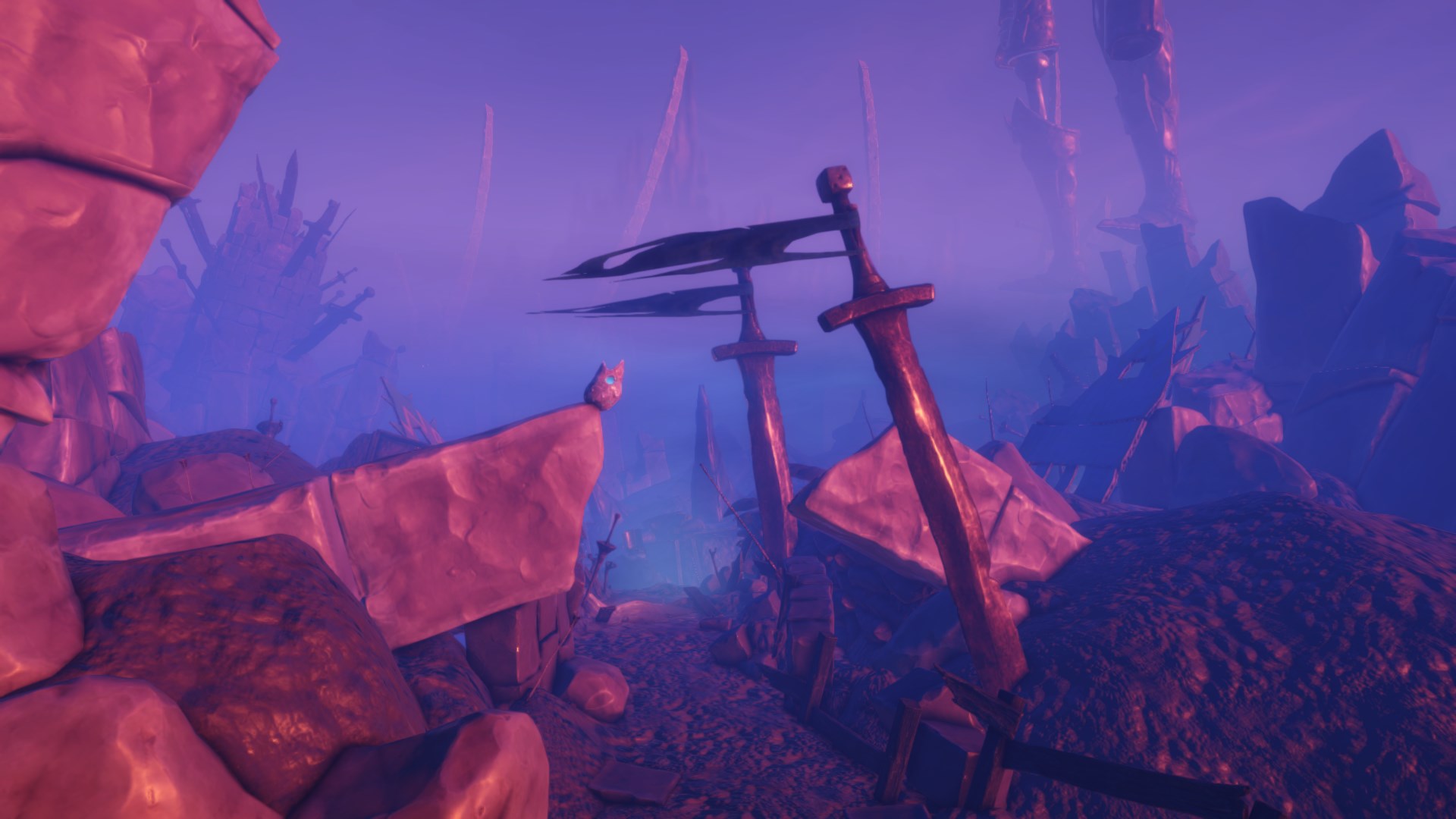
The Fog of Random
An inside look...
During the development of Lost in Random our artists have often posted concept art or other behind the scenes glances. At some point someone wondered if we could do something similar from the code side. While things were a bit hectic at that point I really liked the idea, seeing as I myself love getting to peek behind the curtain of the games I enjoy playing. I wanted to reciprocate and write a slightly more technical piece about what I happened to be working on at that time. A year later the game is finished and I finally found some time to sit down and write a brief article which hopefully provides an interesting glance at what goes into a particularly interesting visual effect and how it helps shape the overall look of our game.
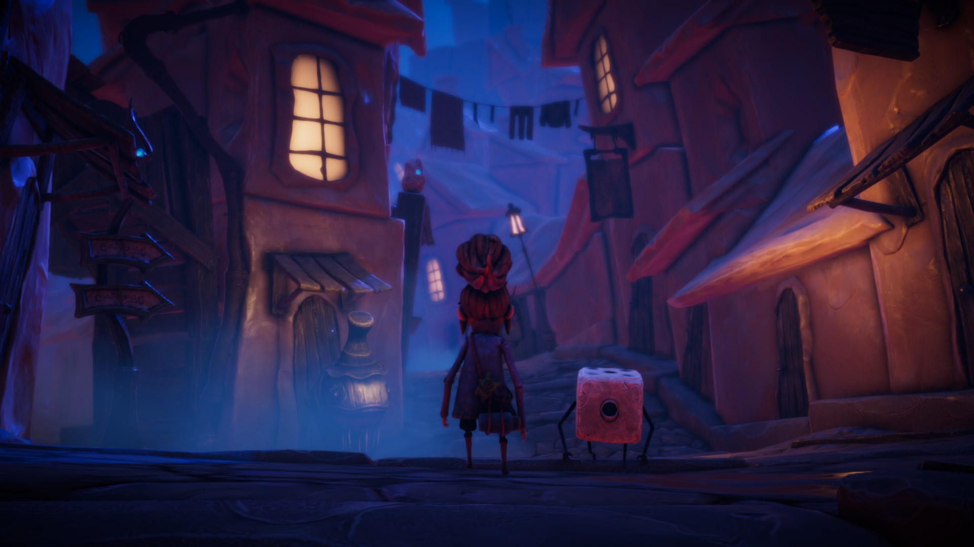
... at the look of Random
Lost in Random has a very particular visual style. A lot of thought and effort has gone into shaping it. When I first joined Zoink as their graphics programmer the game's visuals and environments were already quite far along. My job was more a matter of taking what we had and help mould it into something which could actually run on our target platforms. Getting things fast enough while still looking close to what was originally envisioned has been quite a challenge.
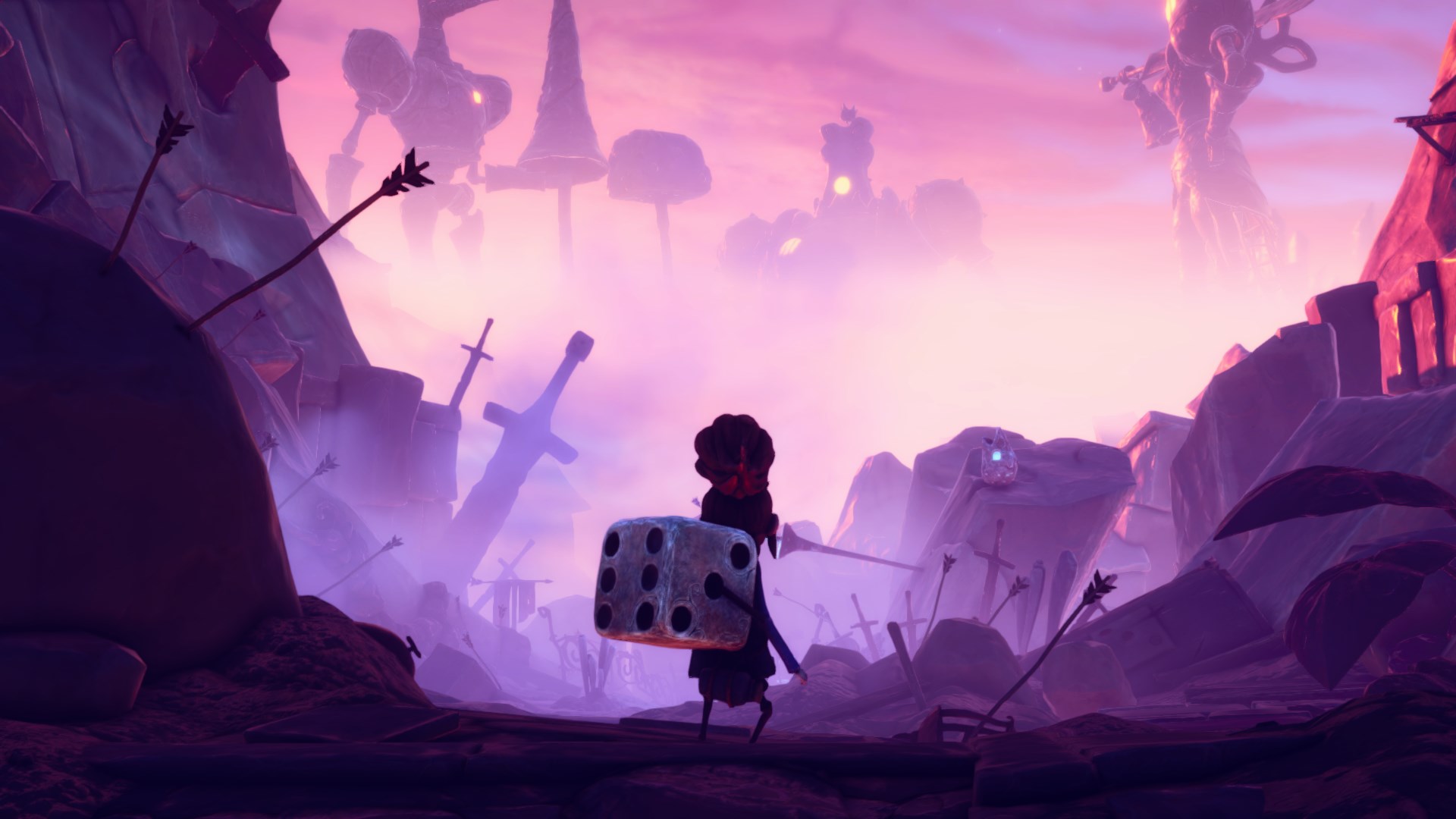
With this article I hope to provide some insight into one small part of what shapes this aesthetic and the work which went into it. While there are many aspects building up this unique look the one I wish to talk about here is the use of colorful fog. It may seem like a simple effect, but it has a big impact on the overall look. To see what I mean, look at these screenshots captured in-engine with and without the fog enabled.
Initially, the project used Unity's High Definition Render Pipeline (HDRP) and its built-in Volumetric Fog. This looks absolutely stunning, but unfortunately proved too computationally taxing for several of our target platforms. The biggest problem, as expected, was Nintendo Switch. The Switch is a wonderful platform. As a gamer it is probably my favourite one. Unfortunately, it's not the most powerful machine.
After spending a few months testing different options and exploring the intricacies of Unity's renderers, the approach we settled on included abandoning HDRP for the simpler but more performant Universal Render Pipeline (URP) across all platforms. While we worried about the less realistic lighting, project leadership actually preferred the more cartoonish look its simplified lighting led to. This of course meant we no longer had access to the HDRP fog. At first, I tried porting this fog to URP, but this proved to be more trouble than it was worth.
In the end we used two different implementations for the fog. There is a volumetric fog used on most platforms. The other is a screen space solution developed to be fast enough for the Switch. Interestingly, we're using this screen space solution in the dream sequences across all platforms.
Volumetric Fog
Our volumetric fog used on higher end platforms is a modified version of Aura 2, an asset developed by Oniric Studio. This asset is very similar to the one built into HDRP from a technical standpoint, but our artists found it easier to configure just the way they wanted. Some work was required to convert it to URP and add a few features we felt were missing.
In order to convert Aura 2 to URP we created a new ScriptableRendererFeature which calls the Aura code and blits the results to the frame buffer. The Camera.onPreCull and Camera.onPreRender callbacks were simply converted to RenderPipelineManager.beginCameraRendering callbacks. We also had to make some modifications to our shaders to make transparent objects play nice with our fog, since they don't write to the depth buffer.
The biggest change made to Aura 2 was adding the directional light attenuation present in the HDRP fog which dims the sunlight the lower you descend into deep fog. Here you can see the same view with and without this feature enabled.
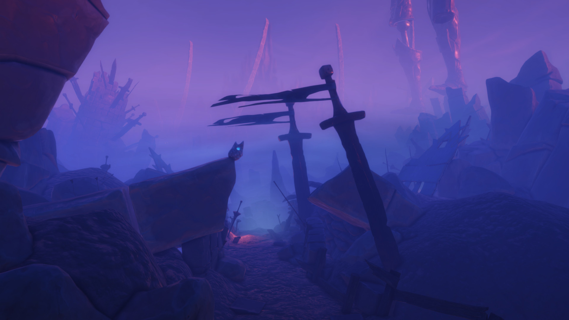
This effect is one of many little changes we ended up making to the Lit shader. It's copied from the height attenuation in HDRP's LightEvaluation.hlsl, which I moved into URP's Lighting.hlsl. The only additional code needed is for our fog volume manager to gather and average extinction parameters from all currently active fog volumes.
Screen Space Fog
In order to retain its visual style across platforms, we needed a fog which looked as close as possible to what was envisioned while still being fast enough to use on the Switch. After evaluating a large number of existing solutions I ended up writing my own exponential height fog meant specifically for the Switch.
What this means is that it is a screen space solution which uses height coordinates to determine the fog color and an exponential falloff for its density. Given a fog density density and a view distance depth the fog color is multiplied by 1.0 - exp(-depth * density) which gives us a factor which starts at 0.0 at distance 0.0 and grows towards 1.0 as the view distance goes towards infinity.
The fog consists of three layers: the lower layer, the upper layer, and the skybox layer. Each layer has its own height, color and density. Anything which is further than a specified distance from the camera and above the skybox height will use the previously mentioned exponential function applied to the skybox layer's color. Otherwise, we calculate the part of the view depth which traverses between the lower and upper height and use it to calculate a viewed height inside the fog. We then use something akin to smoothstep(LowerHeight, UpperHeight, viewHeight) to do an inverse lerp between the lower and upper height and use the resulting value as a lerp parameter between the lower and upper colors. This makes our fog a gradient between these two values.
Well, there are actually two ways to calculate the view height. The default simply takes the height reached by following a ray of length depth from the camera position and through the pixel center. This means the color gradient between lower and upper height is clearly visible across the sky at most viewing angles. The other option is to calculate the average height the ray travels through. This gives a softer more washed out look. I added these two because I wasn't quite sure which option our artist had meant when describing what they wanted. The idea was to let them test both and remove the "wrong" one. After they had been thoroughly tested and compared I was informed that both were needed. In fact, some scenes even ended up with fog volumes combining both of these for a more dynamic look.
Three Modes
A single instance of this height based solution isn't enough to get as close to the volumetric version as we wanted. In order to achieve a better result we combine a number of these fogs in every scene. Our fog supports three different modes which determines when and where they are rendered.
-
Global- Renders as long as the user isn't fully inside a volume with modeRenderWhileInside. This is used to configure the overall look of the scene. -
RenderWhileInside- Invisible from the outside and only rendered when the camera position lies within its bounds. Used to override the global look for smaller areas. -
PhysicalObject- Rendered as a box and primarily used to form a layer of fog running across the ground.
A typical scene uses one or two Global fog volumes plus about a dozen volumes using either the RenderWhileInside or PhysicalObject modes.
Our screen space fog also supports the aforementioned light attenuation. This simply means its manager feeds the Lit shader with the same data as our modified version of Aura 2 does. It doesn't actually affect the fog shader itself. There are some more bells and whistles (such as how sunlight is blended into the fog color), but overall it's a fairly straightforward shader designed to look good enough without needing any information beyond camera transform and render depth.
Swirly fun
My favourite little fog feature was a happy surprise and is actually exclusive to the screen space version. Along the top of the fog volumes running across the ground there's an animated texture with wisps of fog floating by. When first implementing these volumes I added a simple noise to make the fog edge a bit fuzzy instead of looking like a sharp box. I also made it animated to make any patterns in the noise a bit less noticeable. Then, by request from our amazing Environment Artist Leo Brynielsson, I swapped out the noise function for a texture. I had envisioned that he simply wanted to pick his own noise function without having to ask me to make changes to the code. Instead, he used it to make this:
Random Rules!
I hope this has been interesting and that you've come away with some appreciation for the magic which goes on behind the scenes. This has of course only been an overview of how our fog works. There's a lot more to be said, especially around performance. However, that would make the discussion quite lengthy and a bit more advanced than I was aiming for. It's been very exciting to be part of this game and I hope many of you are excited to play it. Lost in Random releases on September 10, 2021 for PS4, PS5, Xbox One, Xbox Series X/S, PC, and Switch.
About the author
Hello,
My name is Daniel "Agentlien" Kvick and I'm a Graphics Programmer with a passion for games.
I currently work as a Senior Software Engineer at 505 Games.
Here you'll find a selection of things I have worked on.
